CEDRIC HOHNSTADT INTERVEW
Ad Agencies and Corporations.
Monday, December 05, 2005
BROUGHT TO YOU BY THE CHARACTER DESIGN BLOGSPOT
IF YOU WOULD LIKE TO SEE MORE CHARACTER DESIGNERS GO TO THE HOME PAGE BY CLICKING HERE
THE INTERVIEW
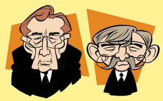
Tell me a little bit about yourself, about your life? Where did you go to school, and what classes did you study? What helped prepare you to become the artist that you are today?
Unlike most character designers, I've never worked in an animation studio or ad agency. I've always been a freelancer, creating work for ad agencies and corporations. My interest in character design is very recent, and I still have a lot of growing to do.
I had a terrific art teacher in high school (Mr. Jeff Pridie) who really gave me a great head start. In college I studied drawing and painting for six years. People would look at my work and say, "You should go into animation", but I had no interest in it. In 1997 I graduated from Moorhead State University with a BFA in illustration and started freelancing. In 2000 I attended a workshop at the Disney Institute and finally caught the animation bug. Since then I've been creating characters for clients all over the country.
Freelancing has not always been easy. There have been a lot of really lean times. But I think financial hardship can be good if you let it shape you and strengthen you. It forces you to assess what is really important. How badly do I really want to be an artist, and how hard am I willing to work to be good at it?
How do you go about designing a character, and what goes through your mind, from start to end?
I'm always learning new things, but here's a few basic rules I try to follow:
1. Understand the character and his purpose. Who is he? What is he about? What will the client be using him for? Who is the target audience?
2. Study the elements of design (Line, Shape, Direction, Size, Texture, Color) and the principles of design (Balance, Repetition, Contrast, Harmony), and look for ways to apply them to your characters. How can I use shape to communicate personality? What repeating forms can I use in the character's design to unify him? Does the design hold together (is it solid and balanced) when viewed from all angles?
3. Simplify! Say a lot with a little. Boil the character down to a few basic shapes. Less is more, especially in the current "retro" style. The trick is to keep it simple but also interesting and expressive.
4. Make him appealing! This is more than just being attractive or cute. A character can be downright ugly but still have visual appeal. Likewise, a character can be "handsome" yet boring.
Respect your subject matter. If you have to design a cartoon frog, study real frogs. Stick photos of frogs all over you drawing board. Analyze them. Sketch frogs from different angles. You better you understand the essence of "frog", the better you can simplify and distort it.
What do you think really helps you out in designing a character?
Look for inspiration outside of animation and comics. That's where keeping a sketchbook comes in handy. Or sometimes I look for inspiration from a movie character or even a person I know in real life. I read that Disney's "Aladdin" was loosely based on Tom Cruise.
Study other artists. When I find someone's work that inspires me I just pour over it. I love art books, animation DVDs, the internet and especially art blogs. I also spend a lot of time on www.drawingboard.org , which has a lot of very talented people. When I find a sketch or drawing online that I really like, I download it into my screen saver folder. It's wonderful to look up from my drawing board and see this slide show of great art on my computer. I also photocopy stuff out of Disney "Art of" books and tape them all around the edges of my drawing board for added inspiration.
Take a sketchbook everywhere you go. Draw all the time. Never stop trying to improve. As soon as you think you've "arrived", your work will start becoming stale. Use your sketchbook to experiment and try new things ("What would happen if I stretched that man's neck and took away his chin?"). Some of my worst drawings are in my sketchbooks, but those are also the drawings I learned the most from.
From your own experience and maybe from some people that you know, what should we put in our portfolio and what should we not?
Go with your strengths. Your portfolio is only as good as your worst piece. It's better to have five really strong pieces than fifteen mediocre ones.
Have a focus. If you want to draw people, don't put in that really great drawing you did of a hippo riding a motorcycle. If you do, sure enough someone will hire you to draw hippos and motorcycles.
Do a little research on the company or person you will be showing your portfolio to. Put in pieces that will fit their needs and take out pieces that don't fit what they do.
If you ever want to freelance, develop your business skills and people skills! If I could do it all over again, I would have taken a business class or two in college. There are some very talented people who never make it on their own because they lack the business skills. And there are some very mediocre artists who are making good money because they are great business people and really know how to promote themselves. I've listed a few good business books on my blog here:
http://cedricstudio.blogspot.com/2005/08/books-every-freelancer-should-own.html
Another terrific resource is the "Media Artist Secrets" podcast. It has a ton of great info about the business side of being a creative professional. Listen to it at www.mediaartist.com or subscribe to it with iTunes.
What are some of the things that you have worked on?
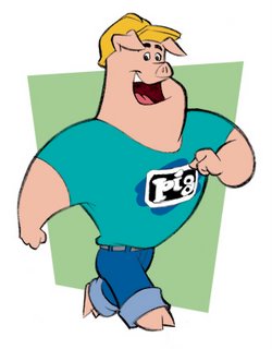
I've done a little bit of everything. I've illustrated three children's books and worked with licensed characters such as The Jetsons and the Exxon/Mobil Tiger. I recently designed a cow for school lunch milk cartons, a pig for a corporate mascot, and a viking for an insurance company. In 2000 I did storyboards for an animated series called "Ribbits!" for Focus on the Family (direct-to-video). Earlier this year I inked two issues of Tom Bancroft's comic book, "Opposite Forces". I really learned a lot from studying his drawings!
I'm also working on a personal project, sort of a mini-comic book that explains what it means to be a Christian. I've posted a very rough draft on my website:
http://www.cedricstudio.com/evangcartoon/index.html
I'm in the process of completely redesigning the character and expanding the story, but I'd welcome anyone's feedback on what I have so far.
Is there a character design you have done that you are most proud of?
Whichever is my most recent. I'm always exploring and improving, so hopefully each new project turns out a little better than the last.
What are you working on now? (If you can tell us)
Currently I'm designing characters for three simple interactive games, to be animated in Flash. In one game the characters are all breakfast foods, one game is office workers, and one game is an ice fisherman pulling all kinds of strange objects out of his fishing hole.
Where is the place you would like to work if you had a choice?
I love working at home, but if I had to get a "regular" job maybe Big Idea (VeggieTales), or of course Pixar (who wouldn't want to work there?)
Who do you think are the top character designers out there?
The best character designers aren't just mimicking a fad style or gimmick. Retro is "in" right now, but another style will be popular five or ten years from now. If you are a solid draftsman with a good design sense, you will be able to adapt to any superficial style trend that comes along. If not, you will be left behind when the fad is over.
That being said, here's a partial list of artists I really admire. Lately there's been an explosion of art blogs on the internet, and people I would have never heard of five years ago are now building huge followings.
In animation: Glen Keane, Chen Yi Chang, Sephen Silver, Uli Meyer, Harald Siepermann, John Nevarez, Tom Bancroft, Rob Corely, Steve Lambey, Michael "Smook" Smukavic, Sumeet Surve, Rik Maki, Darryl Young, Steve Daye, Mark Behm, Milt Kahl, Ed Benedict, Tom Oreb, Maurice Noble, Mike Kunkel, Randy Heuser, Steve Willaredt, Enrique Fernandez
In illustration: Dennis Jones, Dan Foote, Pieter Hogenbrik, Peter De Seve, Jeremiah Alcorn, Mort Drucker, Kyle Baker, Ben Caldwell,
It's also helpful to study great artists from the past. Norman Rockwell, Heinrich Kley, and John Singer Sargent are a few of my favorites.
How do you go about coloring the character, what type of tools or media do you use?
I do rough sketches on standard 8-1/2 x 11 office paper, because it's so cheap. Then I scan and color them using Photoshop or sometimes Painter. Once a design is approved I'll ink the final illustration with a Zig Writer marker on Hammermill 24-lb. laser paper. It's also cheap paper and takes marker lines really well. I color the final art in Photoshop, or in Illustrator if the client requests vector art.
What part of designing a character is most fun and easy, and what is most hard?
The fun part is that you always get to come up with something new. The hard part is you always have to come up with something new.
What are some of your favorite character designs and least favorite, which you have seen?
Glen Keane's Beast from "Beauty and the Beast" is pure genius. He created a character that is 100% human and yet 100% animal, both villian and hero, frightening and appealing. And the design is very sophisticated, yet elegant and reads clearly.
Personally I never cared much for Dreamworks' 3-D character designs (Antz, Shrek, and Shark Tale). Except Madagascar, which had terrific character designs!
What is your most favorite subject to draw? And why?
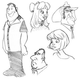
I love drawing people. The human face and body fascinate me. God created us to be so complex and expressive. The human face alone can express so much with so little. Something as simple as a raised eyebrow or a twist of the mouth can say so much. I love to study people interacting and asking myself, "How would I draw that expression? What is the essence of that pose?"
What inspired you to become a Character Designer?
Concept art from the Disney "Art of..." books. I am in awe of the great Disney 2-D animators! They mastered not just drawing, but also acting, comedy, drama, timing, anatomy, perspective, and how to lead the eye. And they draw so fast, and say so much with just a few lines! Yet none of it would be possible if they didn't have a solid and appealing character to start with.
What are some of the neat things you have learned from other artists that you have worked with or seen?
Since I work alone in my frozen cave in Minnesota, I've had to learn from books, and more recently from the internet and from listening to animator commentaries on DVDs.
I'm really excited that Tom Bancroft (Mulan, VeggieTales) just finished a how-to book on character design called "Creating Characters with Personality". He showed me a preview chapter and its packed with a ton of great info. You can pre-order it on Amazon.com.
Also, Chen Yi Chang (Batman, Tarzan, Mulan) gave a terrific lecture on character design which can be viewed on line here:
http://video.csupomona.edu/streaming/asc/chen_yi_chang.htm
What wisdom could you give us, about being a character designer? Do you have any tips you could give?
The best I can do is quote legendary Disney animator Frank Thomas: "Observe everything. Communicate well. Draw, draw, draw." Another quote is one I heard in art school: "Being a great artist is easy. Just draw ten times more than any other artist you know." It's true, there are no shortcuts.
If people would like to contact you, how would you like to be contacted?
E-mail: info@cedricstudio.com
Website: www.cedricstudio.com
Blog: www.cedricstudio.blogspot.com
My freelance schedule keeps me pretty busy, but I'll be happy to respond as soon as I can.
Finally, do you have any of your art work for sale (sketchbook, prints, or anything) for people that like your work can know where and when to buy it?
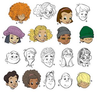
In 2003 I did a sketechbook of heads and faces called "Head Hunting". You can buy it for $7, just send me an e-mail (a lot of the contents can also be viewed on the "sketchbook" page of my website). Recently I inked issues 3 and 4 of the re-release of Tom Bancroft's comic book, "Opposite Forces". Issue 3 is out now in comic book stores. And I've just finished a children's book called "What Your Nose Shows" which will be published soon through Living Waters Press (www.livingwaters.com ).
CLICK HERE TO GO BACK TO THE CHARACTER DESIGN HOMEPAGE
Subscribe to:
Comments (Atom)


